Monday, April 11, 2011
Journal 9: Jacob Trollback
Jacob gave a lecture for the School of Visual Arts MFA Design as Author series. He started out by reminding the audience that he was a self taught designer, which I found to be a huge reason for his success in “designing as author.”
For the most part, Jacob related typography to its affects on human emotion and how that relationship creates the message that a designer is trying to communicate. He uses humor as an example to describe this theory, in that being amused by something, audiences usually respond in a positive way. So, that is why advertisers began targeting this emotion with funny, witty commercials. Another powerful emotion to work towards is empathy. By creating a "story" with the way the type is read (or moves) we as designers can also evoke these feelings of strong grief or inspiration or sadness or even guilt.
Then, he uses some of his projects to display other situations in which the designers writes something to the viewer, not boldly, but cleverly placed to evoke a certain emotion. I loved the montage he created of recent advertisements, for the younger audience. He really plays with music in these ones to engage that specific audience.
And all of this is coming from a guy who started out in a band, and taught himself the principles of design. Impressive.
Sunday, April 3, 2011
Journal 10: The New Futura
After reading the article by Jessica Helfand, "Type Means Never Having to Say You're Sorry" I felt even more confident in our graphic design program. The students that Helfand encountered, were obviously missing out on some extremely necessary knowledge as future designers. I was even able to recognize the lacking emphasis on design history in their program.
But here, we are taught that one of THE MOST IMPORTANT things to keep up with is the history of design and especially designers. We are required to do this so much (by researching, journaling and exploration) that at this point, inquiry comes almost naturally. I have actually learned more about design this semester than i thought possible. Even more, I have become aware of the impact of process... of full emersion, through desire to make progress (personally and academically).
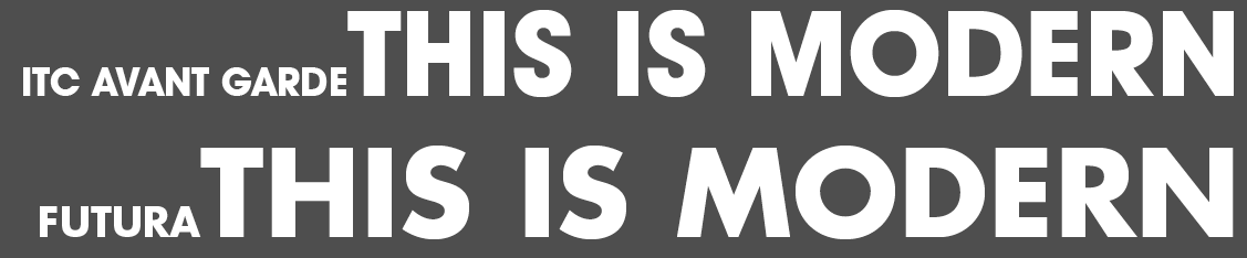
In response to Helfand's thoughts on the modern typeface Futura, I compared it to another recently accepted font, ITC Avant Garde. Herb Lubalin designed it originally as a headline for Avant Garde magazine, then he and co-designer Tom Carnase completed the typeface after the headlines warm acceptance.
They are both mono-weight, uppercase only and wide. There are similarities in the height but sometimes, like the in the case of "R" Futura seems a bit taller. Though they are both wide, Futura has an extreme width in comparison.
I "like" Avant Garde for its boldness, clear concern with stability and lack of impact. Futura has drastically angled finals and legs while Avant Garde lacks those subtle, yet strategic, ways of creating excitement... it seems to fast paced to be a calm/legible typeface. For example, look at the difference in the letter "S" and the "M".
Then, reading an article by designer Michael Bierut, "Designing Under the Influence" made it more clear to me how impressive KU is. It might just be my experience with art history, but I feel really confident in my knowledge of artists and their impact on the design world. Barbara Kruger was an innovator, a conceptual design hero of the 20th century. If designers don't look things things up, or even come across them in classes, how do they expect to learn much... how do they expect to be inspired? Will they just get inspiration solely from the more recent artists, the ones inspired by people like Kruger?
I'm just really glad to be given the opportunity to take classes from professors who have experienced good design first hand... who have been given the task of maintaining a knowledge base of former designers, and design history altogether.
Saturday, April 2, 2011
another distraction...
WOW! My big sister told me about this... am I way behind on finding this site? So much inspiration, but even more distraction!
Sunday, March 27, 2011
The Art of Poster Art
So I got distracted while looking for inspiration for our poster project. But I found a few things that might help along the way. Don't mind if I do!
i just really liked this :)
Journal 7: A Typographic Eye
A cold and dreary stroll early on a Sunday morning.
don't forget the .5
getting smart with the alphabet
ACME!!! its my job
weavers window display
its backwards from the outside
White Chocolate's teeny logo
no caption necessary
masonic temple
arabic at Aladin Cafe
can you call this graffiti?
garden of love
mmmmmmm... a satisfying destination after the long walk
-credit: Ben Pirotte... a dear friend. Thank you for letting me use your amazing camera and photo taking skills!
Sunday, March 13, 2011
Conversations on Design
The Heart: Deborah Adler
The Pieta by Michelangelo is her inspiration because it involves the viewer in a common sense of sorrow. Emotion affects design.
I need to really use aspects of design to evoke emotion. That I have the ability and resources to do that is inspiring to me!
And as for a persons aesthetic, i feel that she was harsh on a designers sense of self. We do not always need to be designing for an audience and that is where she went wrong. Maybe in the professional world, we need to "have a love affair with our audience". But as for me, right now, I am learning design as a way of communicating a specific message. Not to hope that my audience FEELS a certain way when looking at my work.
Get In Touch: Michael Lebowitz
Combining human intellect with technology to come up with the most effective and natural way of organizing the vast and rapid amounts of information that we encounter daily.
He uses ipad as an example and how his 3 year old son can already navigate its seemingly complex system of touch, when compared to a mouse and keyboard.
this is the first time that I have come across a designer/artist who praises the ipad or any extremely powerful form of technology that decreases human interaction on a physical level. Even I normally frown on things that require less tangible forms of communication, but Michael takes an interesting view on the way technology should be natural.
Do More with Less: Emily Pilloton
The product is less important than the way it came about. Instruction and process are parts of design that are important to education and eventually design AS education.
I appreciate the way she describes design as a process to the system of education. the idea that students need to be creative and even selective along the way means more than just doing for a letter grade. I have found that as an issue in my upbringing... I was always worried about learning it to look good on paper, rather than gaining knowledge that would stick, something to be passionate about. That is where my previous education was lacking.
Tabula Rasa: Jake McCabe
Blank slate as an opportunity and as an object is his inspiration. It is a luxury. He thinks, as a designer right now, we need to think about things that no one has asked us to think about yet.
In terms of sustainability, we should come up with solutions and problems that havent been evolved yet. I feel like this comes from the idea that, since we have been "eco-friendly" for so long now and nothing is making a dent on our "footprint" that we need to THINK more effectively. Come up with our own ideas and ways of creating/designing truly unique ways of problem solving.
Monday, March 7, 2011
Common Type Knowledge
What are the advantages of a multiple column grid? Gives room for experimentation, sturcture
_ How many characters is optimal for a line length? words per line? (ringherst reading) a character is the letter, space or punctuation. 40-50 is optimal...
_ Why is the baseline grid used in design? helps the skeleton of the body text structured...
_ What is a typographic river? gaps formed when justifying body text that you do not want... "you want a grey page" fix through hyphenating
_ From the readings what does clothesline or flow line mean? horizontal line to carry the eye... defined where text will hang
_ How can you incorporate white space into your designs? connecting text and text with title, white space on outside, ragged/justified text, adjusting column length and/or type size and typeface
_ What is type color/texture mean? change the weight, size, leading, tracking, column width to see different colors of grey
_ What is x-height, how does it effect type color? tall x-height will seem fuller/darker
_ In justification or H&J terms what do the numbers: minimum, optimum, maximum mean?
_ What are some ways to indicate a new paragraph. Are there any rules? new article, or subhead the first paragraph is not indented, never use default intend.. it should be equal or little more than leading, no intend if using space to denote a new paragraph
_ What are some things to look out for when hyphenating text? no two letters left behind, words that are shorter than for letters, no proper nouns. call outs should not leave lonely words (the should always be on same line in a callout), no more than three hyphens in a row
_ What is a ligature? connecting serif letters to create easy flow from usually difficult combinations, fi and et
_ What does CMYK and RGB mean? cmyk is print (additive) rgb is screen (subractive) most internet is rgb
_ What does hanging punctuation mean? having quotes jutting out to denote call outs
_ What is the difference between a foot mark and an apostrophe? footmark is straight " true apostrophe will have tiny angle and a serif (even with sans serif fonts)
_ What is the difference between an inch mark and a quote mark (smart quote)?
_ What is a hyphen, en dash and em dashes, what are the differences and when are they used. hyphen is shortest one, en dash (option shift) used between dates and breaks of train of though, space on either side, em dash is long, no space for break and denoting name
Subscribe to:
Posts (Atom)