Wednesday, May 11, 2011

Reflection

After a year in the graphics program most people are probably analyzing the large amounts of work done or time spend or tears shed.  I could do the same (because we all know it happens), but the important thing taken from such a difficult year is more than that. 

The reason I went into the graphics program was to learn how to design stuff that people want to look at, pick up, touch.  I was not expecting that to have happened only during the first year.  The projects that are coming out of this program (mine AND everyone else's) have improved so much that its almost unbelievable.  

A year ago, I would look through the blogs and portfolio sites of older graphics kids and get nervous because I had no clue how to accomplish the amount of work they were doing, especially with such talent! They had clean, readable, interesting and "grown up" work.  I feel that now I have an eye for good design and typography (it will still take tons of work to make my work "good design").  But I can now, gratefully, say that with all that pushing from our professors and a lot of competitive motivation, I am proud of this first year.  I am extremely thankful to have finished this year in the well-rounded, well-led graphics program but I more appreciative of the changes I have gone through to get it.   

Monday, May 2, 2011

May 2nd edition

Give me feedback! Be harsh... and keep in mind that it needs a lot of work still!

Tuesday, April 26, 2011

Journal 12: Mossimo Vignelli

a quick bit of after effects play... dont mind the horrible sizing issues just yet.. all the type will get prettier with time.

This is the first tiny clip from JFK's speech in west berlin.  The rest is as follows, “All free men, wherever they may be, are citizens of Berlin.  And therefore, as a free man, I take pride in the words, ich bin ein Berliner.” Which roughly translates to “I am a jelly donut.”
Journal #11: Debbie Millman with Mossimo Vignelli

Mossimo is a sweet old guy, who has been on the forefront of graphic design since his prime.  What I found to be most interesting was the fact that of all this time, he defines meaningless design as “anything which is not pertinent to a situation.” He does agree that decoration could be good, if we did it the right way.  His example is that most designers, or the uneducated/experienced ones, decorate by addition.  Instead we should achieve decoration by subtraction. By making the most out of the least amount of “design”.

Monday, April 18, 2011

Journal 11: Good Magazine

Searching through their site, I found that Good maintains similar styles in their motion infographics.  I noticed the heavy use of rotating the objects to show perspective and depth.  Most of them were solid colors with varied palettes .

My favorite was the teen sex one because it used one plane to show all the info... it just created a common foundation for the viewer and panned from one piece of info to another... easy to follow and comfortably read.

Tuesday, April 12, 2011

“Ich bin ein Berliner” President John F. Kennedy – June 26, 1963

This speech was given in Berlin at a time when the city was divided by the respective governments controling Germany; communist Soviet ruling the East and a combination of the French and U.S. nationalists in the West.  Kennedy went to West Berlin (located in East Germny, yet divided by power as the country was) to reiterate the American’s efforts to eliminate communism and bring up Germany to a powerful democracy.

It brought gave the people of Berlin a little bit of hope. Over half of the population flooded the streets to hear the speech given by the powerful and hopeful Kennedy.

I heard this speech when at a museum once, and it stuck with me long enough to want to use it for this project.  There is so much energy in the crowd and that doesnt even count the perfect word choice and annunciation of the president.  The speech was well written, and delievered with the great confidence.  There are a few phrases that speak not only to the citezens of Berlin, but to everyone.  There is a repeated phrase that reinforces the idea that Berlin is doing it right when it comes to avoiding the communist power.  It comdemns those who are and in a humourous way.

I’d say the mood/tone of the speech is hopeful, welcoming the Berlin citizens into the peaceful ideologies of the U.S. It is uplifting and real, comfortable and natural.


I image the audience was feeling super pumped up... like any great motivational speaker aims at.  I feel his goal was to excite the people of Berlin, and all Germans for that matter, for the promise of peace that American democracy woud bring. And because his speech was delivered in such an interesting way (with variety in pitch/tone/speed/emphasis) the people attending must have been enthusiastic.  

Another interpretation could be possible.  Becaues I am not very political I try not to look into this more than necessary, but it could happen.  One could say that it has similarities to “City upon a hill” sort of deal.  But, here I dont feel that Kennedy, or the US, for that matter, was uninvitedly forcing their systems on the people of Berlin. It could be viewed as critical of the communist east, which it was an undertone, but not fully influenced by it.

JFK Biography (the brief version)

Of Irish descent, he was born in Brookline, Massachusetts, on May 29, 1917. He was the second of nine children, the son of Rose Fitzgerald and millionaire Joseph P. Kennedy who had served as ambassador to Great Britain under Franklin Roosevelt. John attended Caterbury School in New Milford, Conn., then went to Choate Academy in Wallingford, Conn. where he was voted “most likely to succeed.” He attended Princeton University briefly, then majored in government and international relations at Harvard.
Before Pearl Harbor, Kennedy entered the Navy as a seaman. He was commissioned an ensign assigned to a PT boat squadron which patrolled the Soloman Islands. In 1943, when his PT boat was rammed and sunk by a Japanese destroyer, Kennedy, despite grave injuries, led the survivors through perilous waters to safety. His heroic rescue of survivors of his crew won him the Navy and Marine Corps Medal as well as the Purple Heart.
His Inaugural Address offered the memorable injunction: “Ask not what your country can do for you--ask what you can do for your country.” As President, he set out to redeem his campaign pledge to get America moving again. His economic programs launched the country on its longest sustained expansion since World War II; before his death, he laid plans for a massive assault on persisting pockets of privation and poverty.

Research and Exploration of Type in Motion

So... if you just search “type in motion” you get a whole slew of amateur motion graphics projects or maybe experiments.  I began flipping through noticing so many things that could have been done better or even a lot of “ah HA moments” when I saw new techniques and such.

When watching a motion graphic, especially a typography based one, the sounds/music makes a world of difference.  I watched each one twice, first on mute, then with sound.  The first times you get caught up in trying to read the words, and miss characteristic elements that define the context.  You also lack the ability to use unusual compositional elements with the type (like strange juxtapositions, scale and color) when you dont have sound to back it up.

I know these dont technically count as typographic... because there is not type in it anywhere... but these commercials were great! I love the rhyme and the way the image moves together with the sound. It flows well together, and the content is just great! and guess what?

ITS JUST YOGURT!!

http://www.youtube.com/watch?v=cSo3HbkmiQU&feature=relmfu


There are so many times here where the transitions are so smooth you dont even realize you are looking at a milk tsunami one second, then it turns into a womens bright red hair.  another of the elements that impressed me was the timing... the way that the shot is slowed down or sped up to expose something just a tad bit longer.. its just great.

Monday, April 11, 2011

Journal 9: Jacob Trollback


Jacob gave a lecture for the School of Visual Arts MFA Design as Author series.  He started out by reminding the audience that he was a self taught designer, which I found to be a huge reason for his success in “designing as author.”

For the most part, Jacob related typography to its affects on human emotion and how that relationship creates the message that a designer is trying to communicate.  He uses humor as an example to describe this theory, in that being amused by something, audiences usually respond in a positive way.  So, that is why advertisers began targeting this emotion with funny, witty commercials. Another powerful emotion to work towards is empathy. By creating a "story" with the way the type is read (or moves) we as designers can also evoke these feelings of strong grief or inspiration or sadness or even guilt.

Then, he uses some of his projects to display other situations in which the designers writes something to the viewer, not boldly, but cleverly placed to evoke a certain emotion.  I loved the montage he created of recent advertisements, for the younger audience.  He really plays with music in these ones to engage that specific audience.

And all of this is coming from a guy who started out in a band, and taught himself the principles of design. Impressive.

Sunday, April 3, 2011

Journal 10: The New Futura

After reading the article by Jessica Helfand, "Type Means Never Having to Say You're Sorry" I felt even  more confident in our graphic design program.  The students that Helfand encountered, were obviously missing out on some extremely necessary knowledge as future designers.  I was even able to recognize the lacking emphasis on design history in their program.  

But here, we are taught that one of THE MOST IMPORTANT things to keep up with is the history of design and especially designers.  We are required to do this so much (by researching, journaling and exploration) that at this point, inquiry comes almost naturally.  I have actually learned more about design this semester than i thought possible.  Even more, I have become aware of the impact of process... of full emersion, through desire to make progress (personally and academically). 

In response to Helfand's thoughts on the modern typeface Futura, I compared it to another recently accepted font, ITC Avant Garde.  Herb Lubalin designed it originally as a headline for Avant Garde magazine, then he and co-designer Tom Carnase completed the typeface after the headlines warm acceptance.

They are both mono-weight, uppercase only and wide.  There are similarities in the height but sometimes, like the in the case of "R" Futura seems a bit taller.  Though they are both wide, Futura has an extreme width in comparison.

I "like" Avant Garde for its boldness, clear concern with stability and lack of impact.  Futura has drastically angled finals and legs while Avant Garde lacks those subtle, yet strategic, ways of creating excitement... it seems to fast paced to be a calm/legible typeface.  For example, look at the difference in the letter "S" and the "M".  


Then, reading an article by designer Michael Bierut, "Designing Under the Influence" made it more clear to me how impressive KU is.  It might just be my experience with art history, but I feel really confident in my knowledge of artists and their impact on the design world.  Barbara Kruger was an innovator, a conceptual design hero of the 20th century.  If designers don't look things things up, or even come across them in classes, how do they expect to learn much... how do they expect to be inspired? Will they just get inspiration solely from the more recent artists, the ones inspired by people like Kruger?

I'm just really glad to be given the opportunity to take classes from professors who have experienced good design first hand... who have been given the task of maintaining a knowledge base of former designers, and design history altogether.

Saturday, April 2, 2011

another distraction...

WOW! My big sister told me about this... am I way behind on finding this site? So much inspiration, but even more distraction!

Sunday, March 27, 2011

The Art of Poster Art

So I got distracted while looking for inspiration for our poster project. But I found a few things that might help along the way. Don't mind if I do!


i just really liked this :)


Journal 7: A Typographic Eye

A cold and dreary stroll early on a Sunday morning.


don't forget the .5

getting smart with the alphabet

ACME!!! its my job

weavers window display

its backwards from the outside


White Chocolate's teeny logo

no caption necessary


masonic temple


arabic at Aladin Cafe

can you call this graffiti?


garden of love


mmmmmmm... a satisfying destination after the long walk

-credit: Ben Pirotte... a dear friend. Thank you for letting me use your amazing camera and photo taking skills!

Sunday, March 13, 2011

Conversations on Design

The Heart: Deborah Adler

The Pieta by Michelangelo is her inspiration because it involves the viewer in a common sense of sorrow.  Emotion affects design.

I need to really use aspects of design to evoke emotion. That I have the ability and resources to do that is inspiring to me!

And as for a persons aesthetic, i feel that she was harsh on a designers sense of self.   We do not always need to be designing for an audience and that is where she went wrong.  Maybe in the professional world, we need to "have a love affair with our audience". But as for me, right now, I am learning design as a way of communicating a specific message.  Not to hope that my audience FEELS a certain way when looking at my work.


Get In Touch: Michael Lebowitz
Combining human intellect with technology to come up with the most effective and natural way of organizing the vast and rapid amounts of information that we encounter daily.

He uses ipad as an example and how his 3 year old son can already navigate its seemingly complex system of touch, when compared to a mouse and keyboard.

this is the first time that I have come across a designer/artist who praises the ipad or any extremely powerful form of technology that decreases human interaction on a physical level.  Even I normally frown on things that require less tangible forms of communication, but Michael takes an interesting view on the way technology should be natural.


Do More with Less: Emily Pilloton

The product is less important than the way it came about. Instruction and process are parts of design that are important to education and eventually design AS education.

I appreciate the way she describes design as a process to the system of education. the idea that students need to be creative and even selective along the way means more than just doing for a letter grade.  I have found that as an issue in my upbringing... I was always worried about learning it to look good on paper, rather than gaining knowledge that would stick, something to be passionate about.  That is where my previous education was lacking.

Tabula Rasa: Jake McCabe

Blank slate as an opportunity and as an object is his inspiration. It is a luxury.  He thinks, as a designer right now, we need to think about things that no one has asked us to think about yet.

In terms of sustainability, we should come up with solutions and problems that havent been evolved yet. I feel like this comes from the idea that, since we have been "eco-friendly" for so long now and nothing is making a dent on our "footprint" that we need to THINK more effectively.  Come up with our own ideas and ways of creating/designing truly unique ways of problem solving.

Monday, March 7, 2011

Common Type Knowledge

 What are the advantages of a multiple column grid? Gives room for experimentation, sturcture


_ How many characters is optimal for a line length? words per line? (ringherst reading) a character is the letter, space or punctuation. 40-50 is optimal...


_ Why is the baseline grid used in design? helps the skeleton of the body text structured...


_ What is a typographic river? gaps formed when justifying body text that you do not want... "you want a grey page" fix through hyphenating
_ From the readings what does clothesline or flow line mean? horizontal line to carry the eye... defined where text will hang
_ How can you incorporate white space into your designs? connecting text and text with title, white space on outside, ragged/justified text, adjusting column length and/or type size and typeface


_ What is type color/texture mean? change the weight, size, leading, tracking, column width to see different colors of grey


_ What is x-height, how does it effect type color? tall x-height will seem fuller/darker


_ In justification or H&J terms what do the numbers: minimum, optimum, maximum mean? 


_ What are some ways to indicate a new paragraph. Are there any rules? new article, or subhead the first paragraph is not indented, never use default intend.. it should be equal or little more than leading, no intend if using space to denote a new paragraph


_ What are some things to look out for when hyphenating text? no two letters left behind, words that are shorter than for letters, no proper nouns. call outs should not leave lonely words (the should always be on same line in a callout), no more than three hyphens in a row


_ What is a ligature? connecting serif letters to create easy flow from usually difficult combinations, fi and et


_ What does CMYK and RGB mean? cmyk is print (additive) rgb is screen (subractive) most internet is rgb


_ What does hanging punctuation mean? having quotes jutting out to denote call outs


_ What is the difference between a foot mark and an apostrophe? footmark is straight " true apostrophe will have tiny angle and a serif (even with sans serif fonts)


_ What is the difference between an inch mark and a quote mark (smart quote)?


_ What is a hyphen, en dash and em dashes, what are the differences and when are they used. hyphen is shortest one, en dash (option shift) used between dates and breaks of train of though, space on either side, em dash is long, no space for break and denoting name

Jonathan Harris: Cold + Bold


Let's get personal here. If any of you are thinking about reliant we are on the digital world in our choice of careers, you should watch this.  Seriously! 


I am sort of a pessimist when it comes to hoping for a long life full of social interaction, love, family health and all that jazz.  Mostly because I understand and am totally willing to spend the rest of my life focused on a computer screen.  But hearing Jonathan's story really made a memorable mark on this theory.  


I am not involved in the intense amount of coding that he was so my case is a little better.  But i still enjoyed hearing that others are worried about and have the same problems coping with the rest of the world, the non-designers.  This speech by no means made me hopeful for a normal sense of social well-being, instead he made me realize something very important...
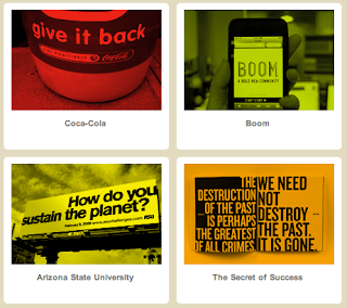

When I get to those frequent points of frustration with my work (whether it is the work itself or the lack of human interaction due to my design) to step back and watch. think, really think about who is around me, what they are doing, why they are there, why I am there.  

Monday, February 28, 2011

Bruce Mau Design


Wow... Reading Bruce's advice really did loosen up some of those knots that I have been tangled up in when it comes do design.  So... here are the bits and pieces that I am going to focus on in the months to come.

I know and understand that studying and being fully immersed in design is necessary for growth, but I have not been practicing that.  Since I do have such desire and passion for what I do, I really need to show it through how much I study, look up artists and designers, search for new ideas, check daily blogs.. that kinda thing.

 ok I get it... designers are always going. We rarely sleep and that is because we have a strange ability to disregard our health and well being because of our need to finish/perfect things.  I definitely follow this to the point of near insanity... and it drives me crazy!  So what do I do about it? read on.
this is it! I have been taking an idea, a very small one, and putting it straight into execution mode.  What if I step back and THINK about it? What if I, for 5 minutes, deeply wrap my mind around that idea and come up with a more vivd solution? yes... that might be it. I will work on this.


Sunday, February 27, 2011

On Creativity by Andy Rutledge


Andy Rutledge is a co-founder of Unit Interactive. He is an author, speaker and composer as well as a design critic.  I appreciate his article On Creativity because he attempts to put creativity into a common term.  


He takes the idea of being creative away from the people who call themselves capable.  In comparison, people don't get creativity or have it... it is not self-expression in the business world.  It is the ability to take the restraints of clients and make them see what you need/want them to see or perceive.  


defining creativity, the misuse of creativity, over-valued creativity, lack of process, not everyone has creativity, perceptions of the product.

Final book jackets and recent journals

Man, posting all of this stuff can get confusing... I have my stuff up on my behance site (behance.net/noelrivard) and on a pdf for class and printed out and now I think i'll put it up here for those of you who didn't see it. 

designers choice

image based

 
type based


Journal number three

Sagmeister talks about the realization of happiness and not about feeling it.  He says that the realization is easy the easy thing to do.  That is why the designer who recreated the subway posters was able to evoke such true happiness, because the people who see his work are taken aback with his design, THEN feel the emotions that he has tried to create.  more later

Monday, February 14, 2011

Its crunch time!!!

For this project, I chose to go with a different perspective than originally planned.  Rather than an all out crazy fest of image, vibrant color and sloppy text I picked a simpler compound word to describe the feeling.  

MEANINGFUL NONSENSE


let me know what you think! please be critical!

Sunday, February 13, 2011

Good old Dieter Rams... and not so old Don Norman

don norman (design and emotion)
1. beatuy
2. function
3. reflective

Don spoke about the good design... not only pretty stuff or convinient things, but honestly good design.  Design as if it were intended to fulfill all 10 of Dieter Rams’ principles.  From what he percieved from Rams’ studies, Norman took a twist on that information by exploring the emotional connotations of design.  As listed above, good design should make you feel good... feel the beauty, the functionality (that it is doing something that makes you happy) and that it can reflect the feeling back. 

If I were to ask Don Norman a question, it would probably invovle the reflective aspect of good design. I am not quite sure as to what he means by that. Maybe something like, “Don, if a product should reflect good design, what does it look like for a product to reflect BAD design?”

audience personas for The Buddha of Suburbia

#1
Amy is a freshman at the University of Virginia majoring in journalism.   She is currently living in a dorm room alone because her roommate has recently moved back home to attend cosmotology school.  Amy spends most nights listening to country music (mostly Taylor Swift) while reading for her upper-level english class.
Her favorite books include Jane Eyre, Sarah Plain and Tall and other more feminine novels.  Her initial intentions were to go to school to be and English Literature professor.  Then she joiner her high school yearbook staff and decided to take that route instead.

She eats mostly organic foods and wears only clothing made in the United States; the only exception is when she is running low on cash.  She works at a used book store where she reads more than she actually works.  Her favorite part of the job is the three-legged cat that roams the store to greet customers. Most of her friends consider this a perfect example of her appreciation for the quarky and uncommon.  


#2
Marshall just graduated with honors from Grinnell and moved to New York to begin a career in the fast paced work of finance.  He has been so consumed by getting a good education and winning his cross country races that he has yet to consider finding a girlfriend/wife.  He finds himself feeling lonely most nights and hasnt mustered up the  courage to put himself out there.  His parents and most of his co-workers assume he is homosexual.  He finds this hard to believe although he has never had a romantic relationship.  
He shops at small boutiques and shops in the wealthier areas of town.  His outfits are all based on images he found in Men’s Health. He listens to the music his parents always had on as a child, mostly bands like Pink Floyd and The Beatles. 


#3
Freida is a 23 year old mother originally from Mumbai but currently stationed in Texas.  Her family moved the United States when she was a little girl to avoid the trying financial times. She has many american friends who appreciate and understand her eccentric cultural background and uplifting personality.  But when she is alone at home while her husband, Waleed, is at work at the hospital, she finds herself questioning her indian heritage.

Her days consist of caring for her 14 month old girl, preparing traditional Indian meals, cleaning the apartment and watching a few soap operas. Freida’s closet is full of her mother and grandmother’s tunics and head dress in beautiful colors and patterns.

She dreams of someday going back to India to travel the country at her own accord. Yet, she is perfectly accustomed to the american lifestyle.


Monday, January 31, 2011

design firms you need to know

CSA Design (http://www.csadesign.com/)
founders of Mr. French paper company


Hatch Design San Francisco, CA (http://www.hatchsf.com/)
"the best design is honest, hands on and human."

Michael Austin wine series designed by the people at Hatch


160 over 90 Philadelphia, PA (http://www.160over90.com/)
"doing it and doing it and doing it well"

An area of the office where team collaboration breaks loose.

A visual identity designed for the City of Boston.


Pentagram London, New York, Austin and Berlin (http://www.pentagram.com)
The worlds largest independent design consultancy

most recent branding for the Museum of Modern Art.


Werner Design Werks St. Paul, MN (http://www.wdw.com/)


personal favorite. i love the web design and type treatment here

Hey! this is the laundry detergent I use at home.  Just
goes to show... good design is everywhere!!!!

Willoughby Design Kansas City, MO (http://www.willoughbydesign.com)
"uncovering insights to help clients connect with their audiences at every touchpoint"

The people at Willoughby created a Brand Dictionary... 
AIGA's A to Z language about branding